
Garmin Custom Watch Builder
I designed Garmin's first-ever watch builder tool to create a fun, seamless experience for users to design a custom watch to purchase. I effectively wove this product into the Garmin.com purchase funnel, directly resulting in increased revenue for the wearables market.
The Plan
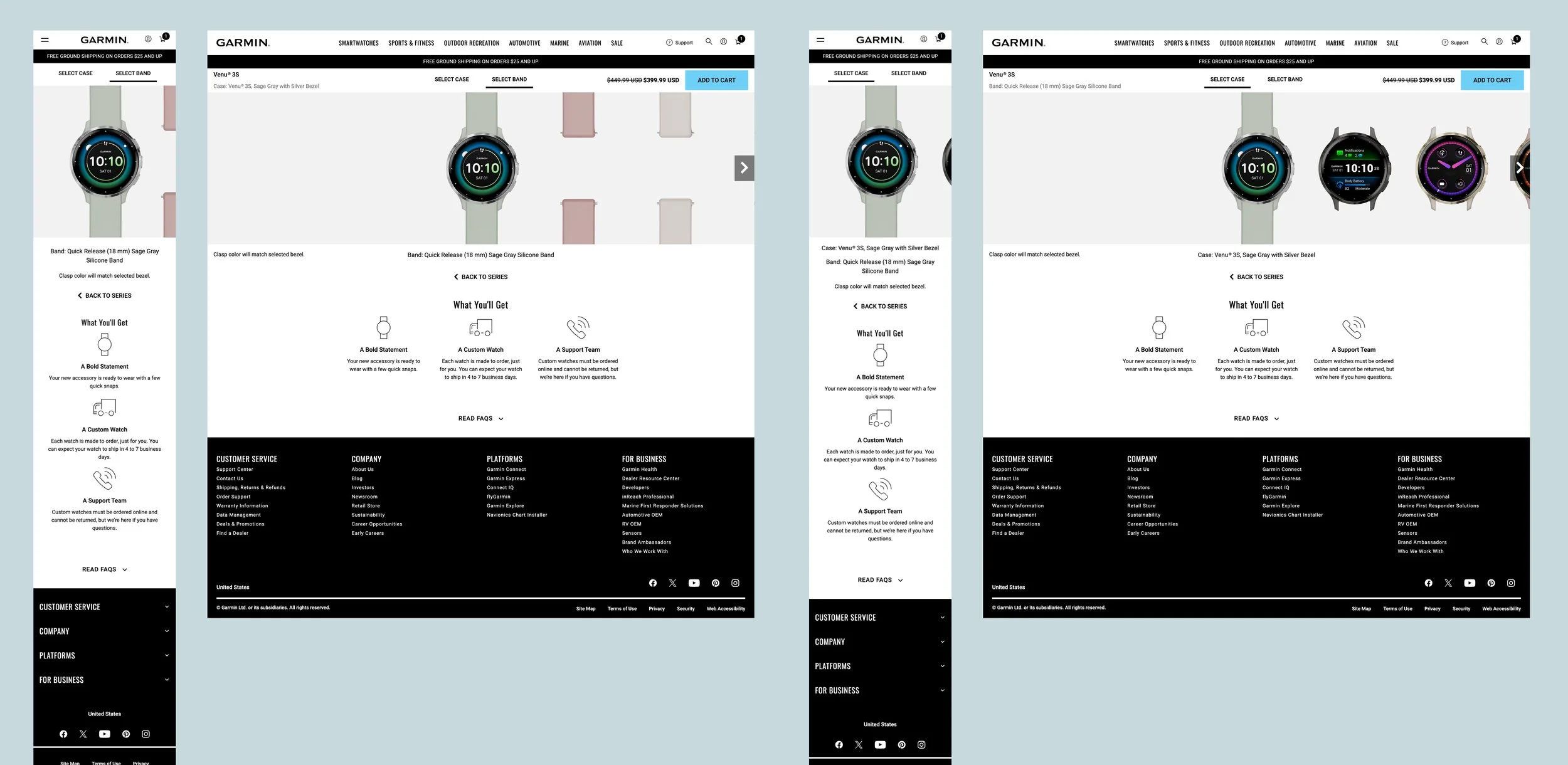
This site needed users to be able to focus on browsing through all of the case and band colors, patterns, and options to enjoy building a watch. We needed the usability of the site to feel out-of-the-way and natural so using the builder was intuitive and not distracting from the watch creation fun. To do this, we planned to incorporate multiple ways to interact with the builder so users would not get stuck. We also made a plan to accommodate the new custom images that would need to be created for the builder to function and to make sure the band and case images lined up.
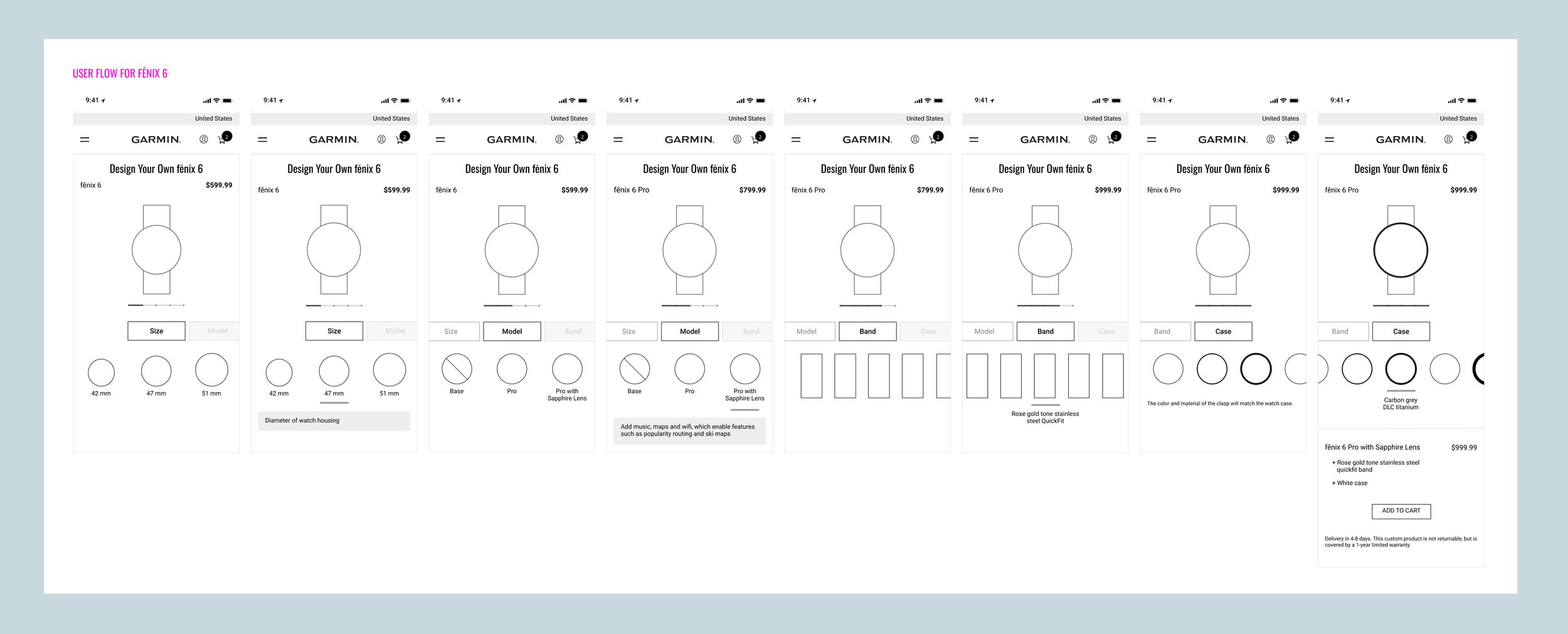
Early low-fidelity wireframes and user flow concepting in collaboration with Information Architect
My Role
As Senior Product Designer, I provided multiple design iterations and potential solutions. I collaborated with the Lead Information Architect to wireframe the best user experience, with the Project Manager and Account Manager to identify the screens and bands needed, and with the Creative Director to create an engaging, on-brand creative experience. When the mockups were approved by Web Marketing executives, I collaborated with the IT Front- and Back-end Developers to get the builder running exactly as expected.
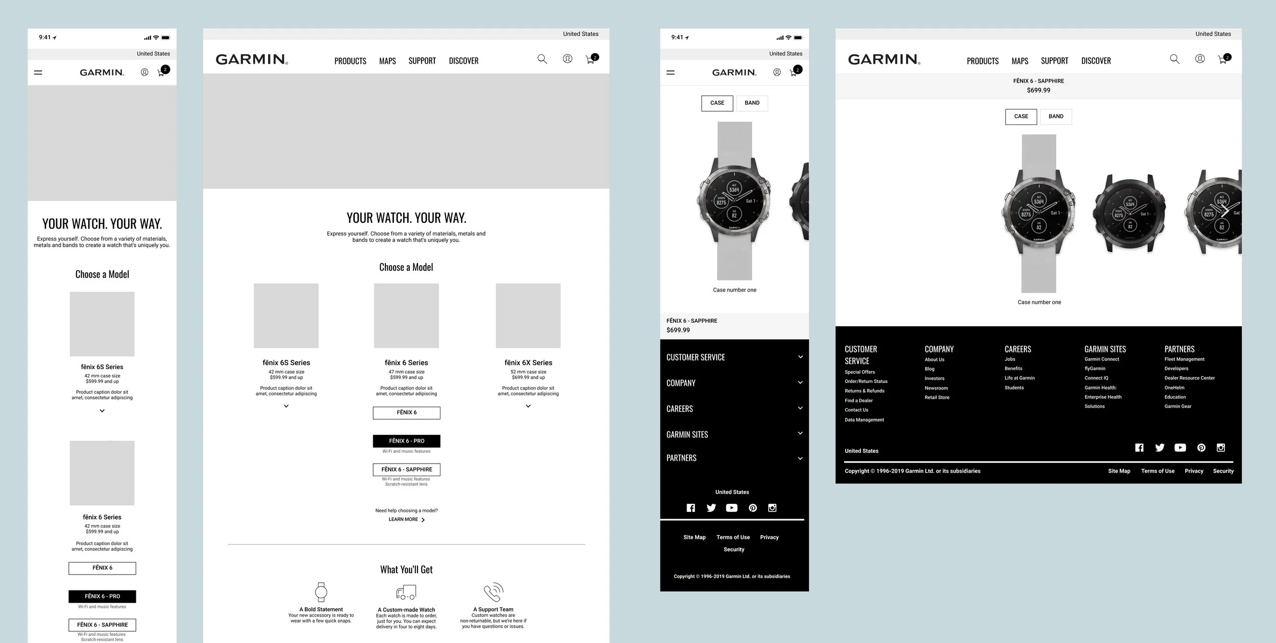
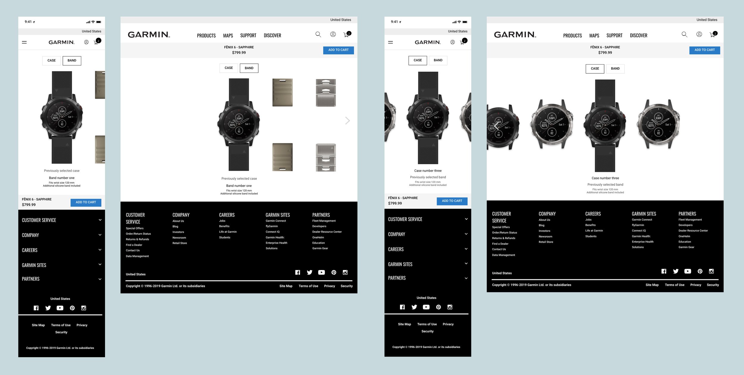
Design iterations in exploration phase
The Process
To improve the conversion rates, I created several design iterations of the primary calls to action within the experience, most prominently the “Add to Cart” button. Through wireframing and rounds of revisions, I provided options for color, size, and placement of this button on mobile and desktop to most effectively and efficiently steer users to make a purchase. We utilized data from Google Analytics to identify the drop-off points and bounce rates, as well as utilizing Hotjar heatmaps to see how difficult or easy it was for users to navigate the tabs, advance to the next step, and ultimately complete a purchase. Pulling this data allowed me to enhance the design by changing the style and location of the buttons and tabs to make the user’s actions as painless and simple as possible, ensuring an effective completed purchase.
Design iterations in exploration phase
The Final Product
Your Watch Your Way is now a fully functional watch builder that allows customers to start with a product of their choosing and customize it by selecting their favorite case material and band color, and then add their custom-created watch to their cart for puchase.
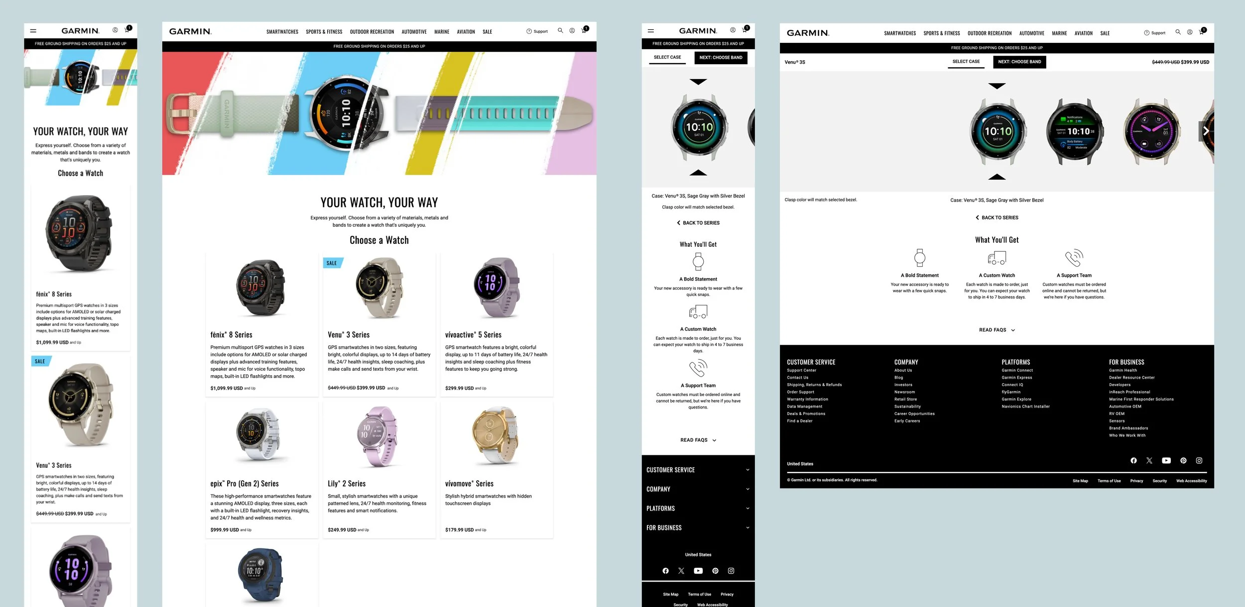
Design System Integration
Although the design and setup of this site was uniquely custom, I still utilized existing Design System components wherever possible and enhanced components with new functionality to meet the specific needs of this product.
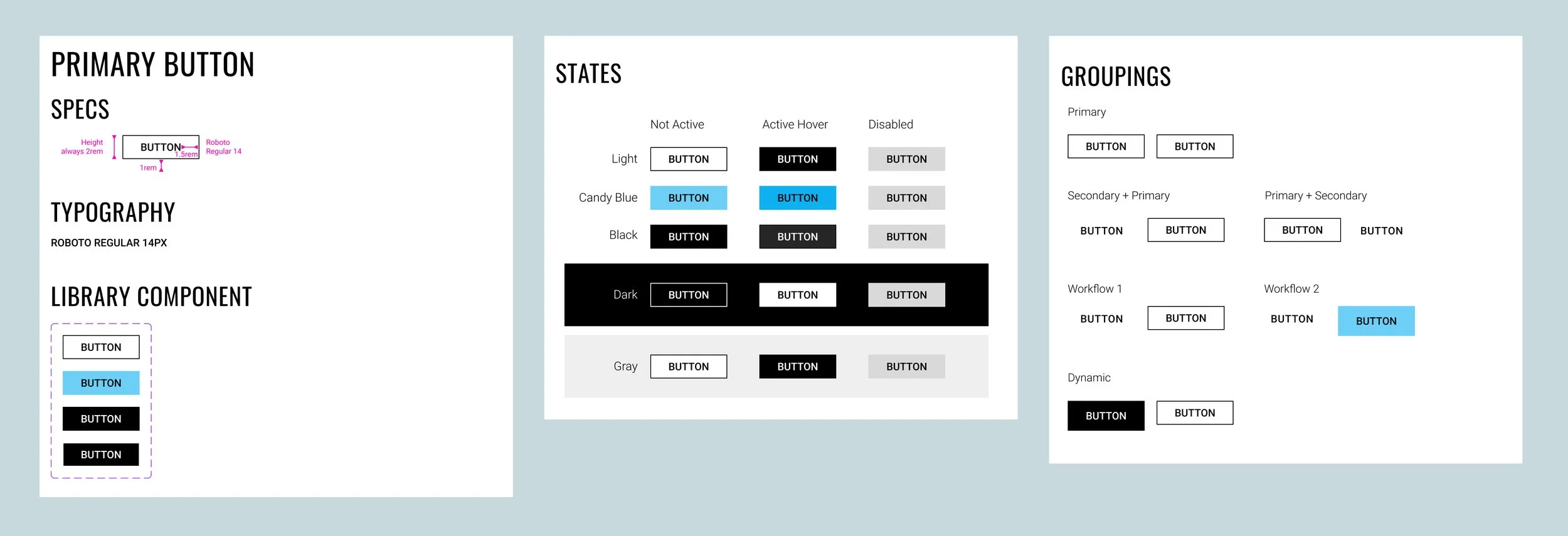
Button Component: The global button component was enhanced to add the candy blue color option within the primary button variations. The business requested that the Your Watch Your Way primary call to action be even more prominent than usual, so a candy blue button was added to align with one of the brand colors from creative.
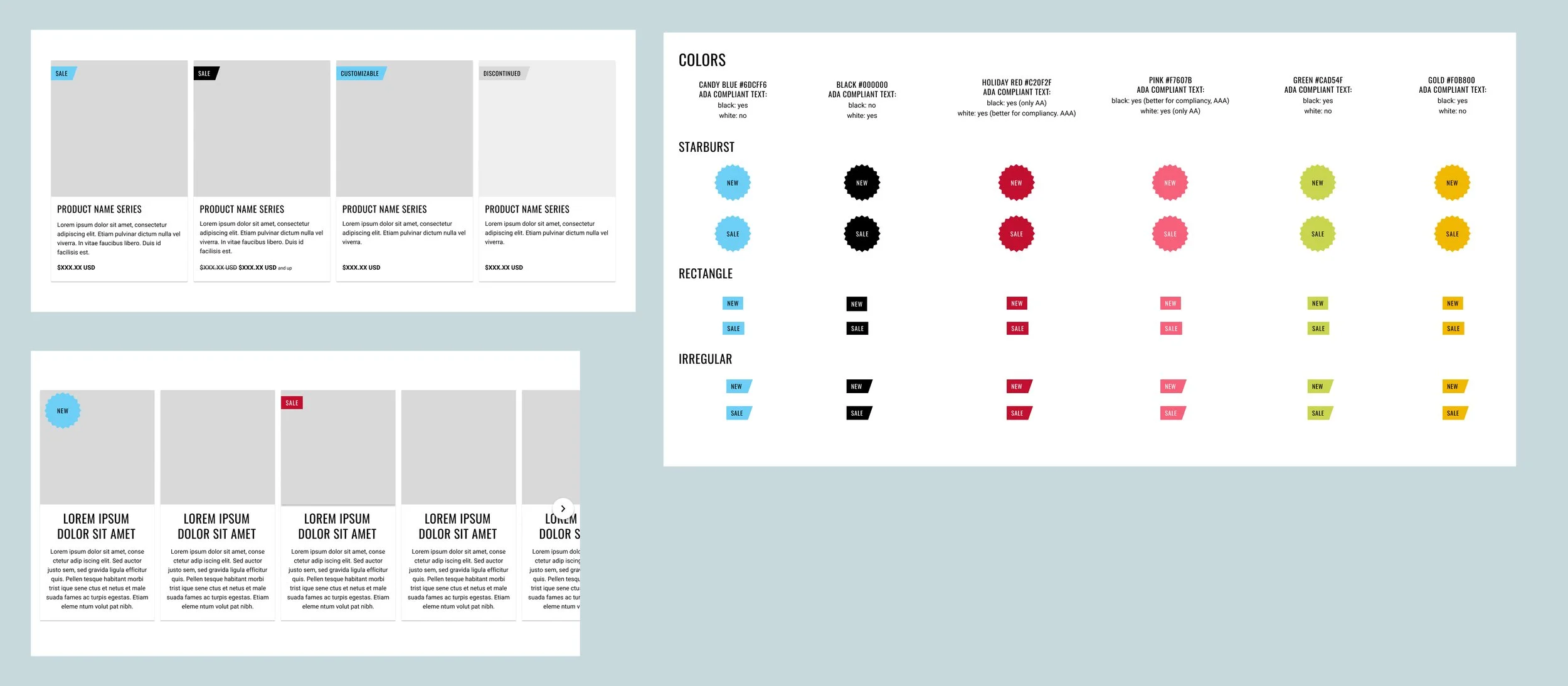
Kicker Component: I created the Kicker component to support this product’s unique needs of showcasing special messaging for products, including “New”, “Sale”, etc. This new component was integrated within the existing card component, designed to align with brand patterns from creative, and scaled to allow for longer languages in translation.
Icon Component: I enhanced the icon component to support the landing page of Your Watch Your Way. It was important to stakeholders to show all of the available features at a glance, so we set up this component to allow users to get a quick scan of the most important information before clicking into the watch-building experience.
